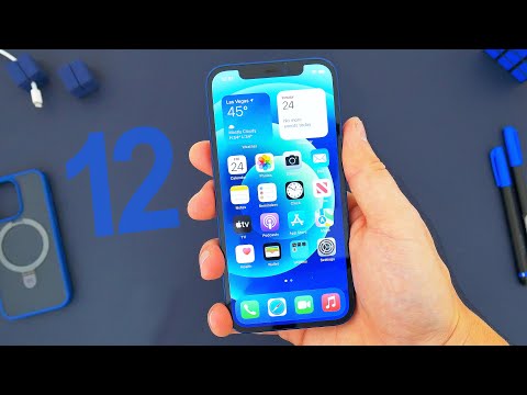
Between the unchanged screen size and the familiar, Face ID-enabled notch up top, it’s clear the iPhone 12 isn’t a massive reinvention of Apple’s modern smartphone. Still, the myriad improvements and improvements collectively make this a bigger upgrade than expected.
From the addition of 5G support to a higher-resolution OLED display and attractive design improvements, the iPhone feels quite the refresh with this edition — and importantly, the core, non-Pro iPhone no longer feels like an “inferior” model, unlike the last few iterations. Given the similarities between them, and the $200 price difference, the iPhone 12 may actually end up being the better choice than the iPhone 12 Pro for many users this time around.
While the iPhone 12 still feels like a successor to the revolutionary iPhone X design philosophy, Apple looks even further back for inspiration, drawing from some of the best iPhone silhouettes of all time. Gone is the rounded, bulbous shape of the sides, replaced by a sharply flat aluminum frame similar to that of the iPhone 5 and 5s.
Call it a mash-up of some of Apple’s best phone design elements, but it makes the iPhone look distinctive again after many rivals made their own interpretations of the aesthetic. Apple has also revamped the color selection this time around, with the deep blue option seen here joined by a lighter lime green, while retaining the familiar black, white and (Product)RED options. The color of the rear glass matches that of the aluminum frame, making for a bold, alluring look.


