Some iPhone users who recently updated to iOS 18 have encountered an ugly iCloud design in the Apple Account section of the Settings app. It's been called "the most un-Apple design in iOS 18," and we agree.
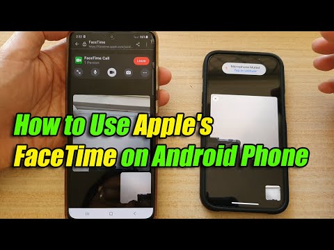
How to Use Apple's FaceTime on an Android Phone
It's undoubtedly the ugliest device Apple has ever released, and Redditors, myself included, have decided to judge it with the same standard with which we criticize some of Android's bold design experiments: rightly so.
If we had to dissect the monstrous iCloud subscriber logo, here's how we'd do it:
And it’s no exception. Users have found all sorts of tasteless design implementations in iOS 18. This example only confirms the fact that Apple has been asleep at the wheel and has been releasing buggy updates.


